

When Gregory released "(I Fell in Love With) The Majesty of Colors" in 2008, the video game world was rather different. Flash games were big. No smartphones supported Flash, but that was fine; the iPhone App Store only had 10,000 apps, with the best-selling being a peaceful thing called Koi Pond. Monitor resolutions were smaller and there was no such thing as a Retina display.
The primary typeface in the game was Unibody Pro, a perfectly nice font when it's large enough or you have good eyes. However, given the wider range of resolutions and screen sizes we're dealing with for the remastered version, plus our greater dedication to accessibility, we need better options.
We considered using the same font, just scaling and outlining it to improve legibility and contrast. But Unibody has another problem. As you can see at the link above, it's a pixel font where each individual pixel is its own shape, with a tiny gap in between. This makes it very difficult to scale and modify with effects. We made an attempt, but we finally decided to change fonts.
Our Solution
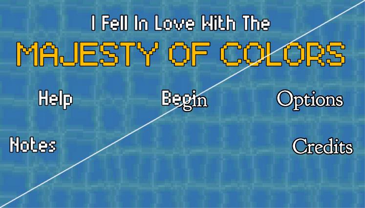
We ended up settling with two fonts: one pixelly and one serif. Each typeface will be available in large and original (small) sizes, and each is outlined in a contrasting color for better readability against a variety of backgrounds.
Our pixel font is Munro by Ten by Twenty. It's a slightly narrow font designed to be shown at multiples of 10px that looks a little bubbly and may be reminiscent of some early Macintosh fonts.
Our serif (and non-pixel) font is Goudy Bookletter 1911 by Barry Schwartz and the League of Movable Type. It's a classy font with a bit of quirkiness that's based on a pretty typeface by Frederick Goudy.
In the end, we have two very good options that look good at two sizes. We're still keeping one typeface from the original Flash game: FFF Harmony by Fonts For Flash. The main title and certain headings use this rounded pixel font, which is an iconic part of the Majesty look.

 View on YouTube

