Often, the most effective ways to communicate a work's tone are also the most subtle adjustments. In digital games, creators too often put off or overlook background sounds, even though they immediately set a mood.
Our roleplaying game sourcebook Rosette Diceless doesn't come with a soundtrack, but books have a similar aesthetic ambience: layout and fonts. Melissa already discussed layout and images and ornaments in their post about our technical journey on the book, but fonts are a decision we're only just now solidifying.
The Modern Period
Technically, what we think of as a "font," such as Verdana, is really a typeface; the word font actually refers to a specific style and size of a typeface, such as 12pt Helvetica Bold. For a long time, we at FPG saw Rosette Diceless (then called Rosette Dramatic LARP) in TeX's default typeface, Latin Modern:

This is a perfectly serviceable font, especially for its assumed home in technical papers. However, it's a bit stodgy and generic. The serif font used for body text has a large range of line thicknesses, which makes it look a bit frail to me, and the rounded ends on the sans-serif font evoke unpleasant memories of cartoony fonts like Comic Sans.
We knew we would want to adjust typefaces, but we put it off until after editing.
Helvediting
Editing was done in Google Docs so that we could easily track revisions and access the working file from anywhere. It was also an easy way to share the document, so the first view our playtesters had of the book was in Google Docs's default typeface, Arial:

Arial is heavily based on the classic typeface Helvetica. One of its creators said it was "designed as... almost a bland sans serif." Its ubiquity in digital works, especially in Windows, has further solidified its feel as "default." It conveys nothing aesthetically, and we always knew it would not be the final typeface we used.
Noto Too Different
After switching to PrinceXML for typesetting, choosing a typeface was easier than ever before. One of our thematic touchstones for the look of Diceless was "circa 1900 theatrical advertisements," so our initial choice was Goudy Bookletter 1911. However, we realized that it lacked a proper bold font and wasn't kerning too well, so we looked elsewhere.
After considering typefaces like Lora and Gentium Book, we settled on Noto:

Funnily enough, Noto is really no less generic than our original non-choice of Latin Modern. It is a default font for Android phones, created by Google and based on Droid, the old default font for the Android. However, it is easy to read, has an attractive curve to its brackets and terminals, and doesn't suffer from the thickness variability problems of Latin Modern. It's not an interesting choice, but it's an attractive and safe choice.
Heading the Right Way
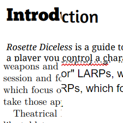
As you can see above, the initial heading typeface I chose was Chunk, a provocative ultra-bold choice that leaned heavily into the theme of turn-of-the-20th-century print design. However, Melissa pointed out that it was distractingly bold and was serif in a way that clashed with our body text. We ended up switching to Amaranth, resulting in the font combination we intend to release with:

Amaranth isn't particularly faithful to our design theme, but it's friendly and graceful. To me it evokes sign calligraphy: you can imagine its angled terminals and italic swashes being produced by a sign painter up on a ladder holding a broad brush, making each letter with a sequence of flowing strokes.
Little Choices, Big Results
Picking a typeface feels inconsequential, but it affects every square centimeter of your final book text. We don't know if we'll use the same typefaces for future Rosette books or adapt them based on theme for each one, but we're pretty happy with how this one turned out.


 View on YouTube

